Friday 31 January 2014

Inspiration for Cover

Embedded image permalink


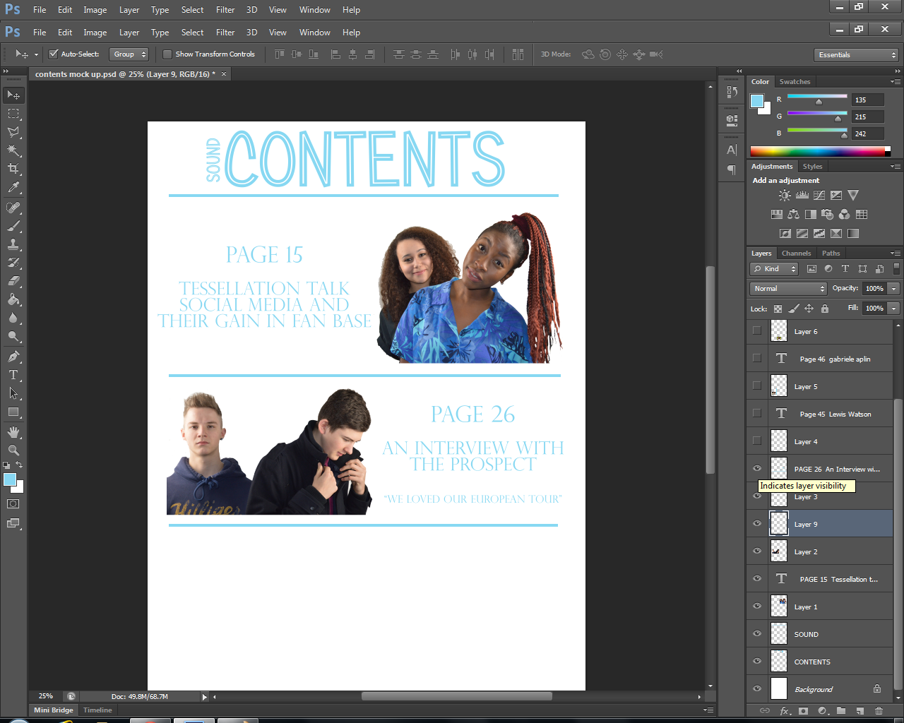
I have hand made the design for my front cover draft, as I feel this way I get a better image of how to present everything, the dimensions and measurements to ensure it looks professional.

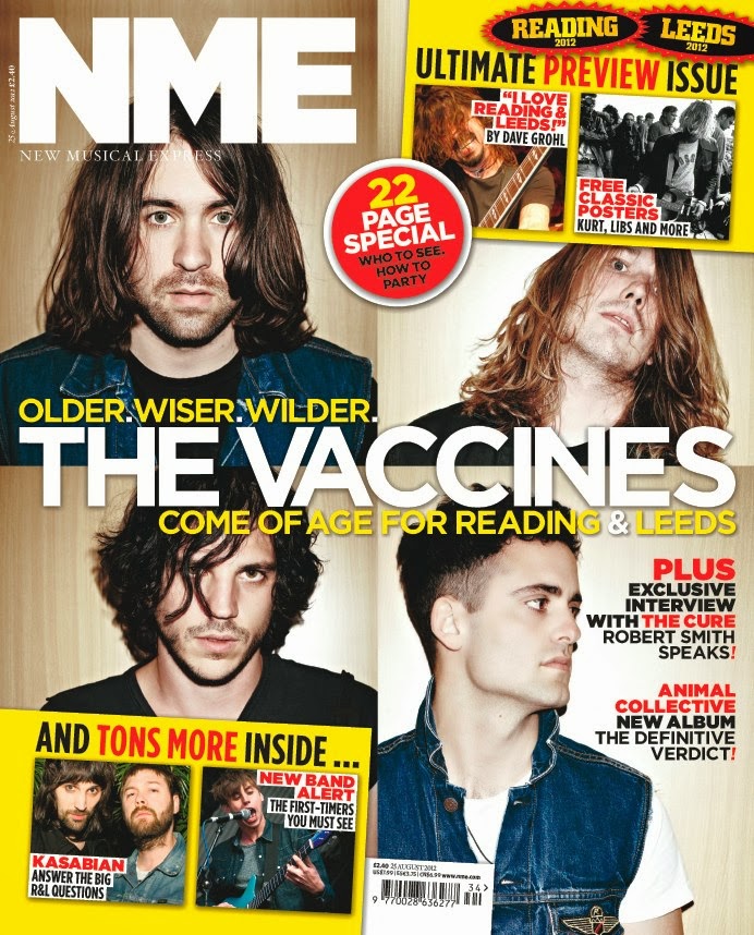
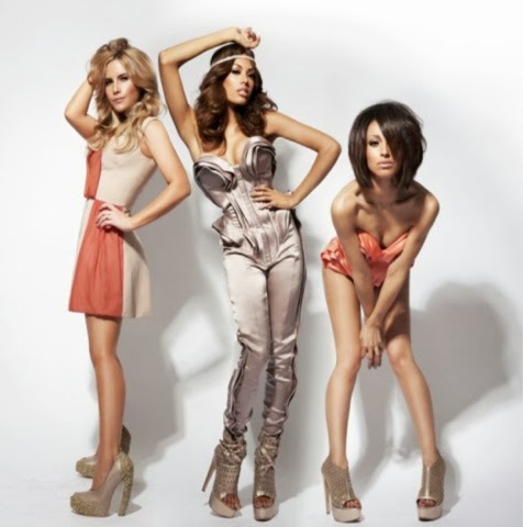
I have used to image from the BEAT Magazine as I will replicate this for my cover, and as I haven't yet done my next photo shoot I haven't got a photo of my models doing this pose.

I have also chose the theme and layout of my magazine to be like the MR SCHUMAN which I found from the 'Turning Pages Editorial Design For Print Media'. My reasons for choosing this design is because it is simplistic but effective, and will show off my genre well, with the organised and cute stereotype.

Thursday 30 January 2014

House Style

I will follow a house style so that all pages of my magazine have a connection, so that the audience can tell that it is from the same magazine.
My colour palette I have chosen to keep my theme is black, white and a pastille blue, as these colours not only look good together, but are also associated with my genre. 

Another thing I feel is associated with my genre is floral patterns. I would like to create a floral pattern on Photoshop to have as a banner which will feature on all pages. This is because it fits my theme and I think personally it would make my magazine more aesthetically pleasing and draw attention to my target audience. 

Wednesday 29 January 2014

Development of My Photography


 I have extended my research into looking at the positions girl stand in for their photo shoots they attend for magazine covers and articles. This has allowed me to develop my thought for not only what my models should wear clothes wise, but also how they should stand and what is more effective and catches the eye of the target market. Even though I looked at photos of 4 piece bands, it was still helpful, as some of the stances used by all the girls can be recreated to different measures for my shoot, which I can play about with.


I like the idea how in most of the shoots the girls are all of different heights to each other to create attention or focal point in the photo to look at, as it gives it an edge. This is something I would like to experiment with in the next photo shoot that I do. Another thing I also like about these are that most of the photos aren't serious, they all look as if they are having fun, which portrays a positive 'innocent' look for the band. Another thing I would like to do for my next shoot that I have researched for this post is the camera angles used to take the photos. I would also rather than getting direct shots, either close ups or mid shots I would like to see the effect high shots and low shots have upon the photos taken, and if they are effective. The only way I feel i could see if this works it by practically doing it in the studio with my models, and experimenting at the time. 


Further Research and Development


I have found further magazine covers in which have taken an impact on my ideas, as I now feel I will have to create two draft covers to enable me to see which decision works the best. I have chosen to take ideas from both the Beat and DIY covers, as I feel these are really effective and would work with my band as they are a duo.

I feel these two covers are effective for different reasons, my favourite of the two is the Beat, however I feel it is too simplistic for the image I'm trying to create, and therefore I would adapt it to an extent to which it wouldn't look the same, it would only have similar fine details. I feel however this design works well with a black and white photo which is what I would like to do for my cover.

The issue I could possible attain from creating the DIY cover is that the white back drop I take my photos on isn't white, so rather than  deleting the background like I have done for my Prelim and practice drafts, I will have to play around on Photoshop to see if I can change the colour of the background to something which fits with my colour palette.

Flat Plan - Double Paged Spread


To create my practice flat plan double paged spread I used a software on the school computers called Page Plus X6 as it enabled me to accurately create columns which are important for a double paged spread. This isn't the design I am looking at using for my real draft, however I feel that by using this a practice it enabled me to become familiar with the software, and so therefore in future when I come on to making my draft, I will have experience using it, meaning my design and layout will look better.

I found this software difficult to use at first, however with teacher guidance, and playing about with the tools primarily before creating this piece, I was able to create a flat plan for a double paged spread.

Improvements I can pick out:

  • I have used the colour blue far too much in this double paged spread, it makes it extremely difficult to read, and therefore doesn't look aesthetically pleasing 
  • I haven't used borders, and my pictures blood out to the edges which makes them look lost on the page and creates a lot of plain open space which I need to ensure I get rid of
  • I need to add borders around my photos to make them look more professional
  • I need to ensure I have page numbers at the bottom of each page
  • To fill in blank space I need to ensure that I use solid blocks with text in which refers to parts of the article to make it look more professional
  • I need to use a pull quote from text to engage the audience as soon as they turn to the page, to give them an insight of what the article is about
  • I also need to ensure that I use captions to state what each photo is/who is in it 

Tuesday 28 January 2014

Flat Plan Contents

I created a flat plan contents page with a photo I took in the studio of my artist Tessellation, and one of my class mates photos she took of her band The Prospect. I made sure I had permission from Krishna to use one of her photos she will not use for her magazine to ensure I wasn't copying her work. I used Q as a style model as I felt this was a good layout for a design. 


Flat Pack Cover

I created my flat pack cover with images from Google, whilst on an Apple Mac, which I thought were the most identical to my models as possible. There is an issue in head sizings and the closeness of the picture. This won't occur when creating my draft version as I will ensure that the photos are of the same size and standard etc. The other issue I faced when crating this is that I forgot to change my photos from colour to black and white, which made it not as accurate as it could be to what my draft will look like. I also didn't include a barcode, date or issue number as I was getting used to working on a MAC which I don't usually do, this caused many issues as it took me a while to to find out how to do certain things, even though Photoshop is pretty much identical to what it is on a computer.


Monday 27 January 2014

CD Cover

For my girl duo/band I decided to create an album which I mentioned in the draft article, to show different skills I have in creating all types of material for what a band would sell on a merchandise site for example.

The reason as to why I chose to use a vintage picture was because I feel it portrays a very girly image, which is what my band is all about. Not only that but it would also attract the target audience (Fan Girls) because you associate the colour pink with the feminine gender.


Extra Inspiration

Even though The Vaccines are not a band that fit my genre, I like this magazine cover for the way it is laid out. Even though the colour palette doesn't include the same colours as mine which I have chosen, it has a unique edge to it, which lots of magazine covers don't.

The thing that struck me was how the cover was sectioned out so each member of the band had their own head shot. This was particularly interesting because it isn't the usual way of representing an artist on the cover of a magazine.

I also like how each band member has relevant information in each box which is relevant to the content inside which attracts the attention of the audience, as there is lots going on. For this genre i feel it is a good idea, however I would have to adapt it for my particular genre as i feel it wouldn't work as well. 


I also like Gabrielle Aplin's EP cover for her song 'Home' as it has a vintage/old edge to it, which I feel fits with the type of artist she is. There is significance with all of Gabrielle Aplin's album artwork as they are all photographed outside which can connote to her audience that her music is fresh with purpose and meaning to every lyric, comparing it to the wind whistling and the natural sounds to the outdoors.

Another which strikes me with this album artwork is the wrinkle look/style. I feel this is extremely effective because it makes the product aesthetically pleasing and captures attention sitting on a shelf in a shop. 


I found inspiration in a painting by Lina Davidaviciute. I feel this is a really effective piece of artwork which really captures emotion and body language of two people. The colours that have been used are significant as they particularly highlight the image of the people who are central, as if they have importance. The use of reflection denotes that in the scene it is raining, and the people are on the street. I feel this is effective as it also demonstrates the outdoor lifestyle which connects with my genre of music.

I don't feel I could replicate the outdoor photography/scenery because the photos I wouldn't be accurate or of a high standard like they would be in the studio, due to the lighting equipment, and unprepared conditions of weather.


This issue of NME with disclosure featured on the front struck me. I felt that this was interesting to have the two men upside down on the cover to show their 'lad' side to them, which creates a jokey and fun image for them. This fits well with their genre of music because it fits in with electronic/dance style, which means being silly and having fun in a club for example.

I would feel it difficult to recreate this, due to the facilities available, however, I feel that for future drafts I could adapt this idea and make it my own, to develop a quirky and fun side to my magazine, which would attract attention to itself as well as the readers, especially a teenage market, as they are all about having a good time.


Teacher Feedback


I received feedback from my teacher which indicated sections of my blog I should improve to ensure I reach the grade I have targeted for this coursework. I acted upon the first comment the same day, to ensure my analysis of the covers, contents and DPS were more detailed, and laid out in a way that the examiner would wish to read them.

I uploaded all of my prelim work beforehand, however to ensure it was up to standard, I added in a brief reflection of what went well and where I could improve, this was prompted by questions provided in class.

I created a new post just yesterday with regards to connecting language register with a style model. The style model I chose was from February 2014 Q Magazine which I purchased from a supermarket. This allowed me to reflect on the good parts, and allow me to put it into practice when writing my own article, which I also did yesterday.

I have also created a post on fashion after receiving comments, with Adele as the base line. This research helped me style my models for my first photo shoot(s).


Sunday 26 January 2014

Poster


The reason as to why I have chosen to produce a poster, is because it outlines how my band would be promoted by institutions if they were real, and the article was truthful. Every year HMV create a list of artists to watch for the oncoming year, which I have decided that my band would be one of them. This poster is a replica, one I have made myself,  to show it isn't plagiarized, and outlines development of planning and research. 

This Weeks Reflection and Next Weeks Goals

This week I have completed many tasks, the most successful being my first photo shoot allowing me to show my organisation skills, ensuring both my models were available, and brought everything they needed, as well as booking myself a slot for the studio. I also developed my creativity, and looked into branding my blog, to show off the type of lifestyle my target market live.

I began a flat pack model, however didn't complete it, due to difficulty in using software from home I wasn't familiar with, however I completed research on the content of my article, I sent out a survey and evaluated feedback from my target audience, as well as commenting on my peers speeches, to ensure they got constructive feedback, and finally drafted my article.

I feel it was a successful week, I didn't create as many posts this week as I have in previous, however more care and accuracy has gone into them, to show make sure my potential is shown.

With in the next week I hope to complete my flat plan for my cover, contents and double paged spread, as well as evaluating it. I wish to develop my researching even more into magazine styles and content, to see if I can use anything as inspiration. My final goal is to complete my draft of my cover, contents and add images and make a page layout to compliment my article I have already drafted, as well as meet the class deadline.


My DRAFT Article

Social Media - Pain or Gain?

'Tessellation seek support'

In her own mind, Tessa Maxwell (Guitarist) has been reliant on social media sites such as Twitter and YouTube to gain public support and opinion for a number of years. Now being signed to Universal Music, with a studio based down in London, it has branched out a whole new career path for the two young Leicester girls who call themselves Tessellation. "Rather than going out of your way to find a record label that will sign you, publicize your band on sites such as Twitter, create a fan base, get yourself trending, and they will come running to you. At least, that's what happened to us."

The two 18 year old girls, well known on the streets of Leicester for busking since the age of 14, seeked support away from the locals to see if anyone their own age took a liking to them. Within 24 hours of them posting their first YouTube video, with a cover of  Gabrielle Aplin's song 'Home', they gained over 20,000 views, 1,500 subscribers and 7,850 likes. With the positive vibe they gained from an effortless action, it spurred them on to create another video, this time, only 30 seconds long, asking their subscribers to follow them on a Twitter account they set up that day. Due to another huge response from not only UK citizens but European, the girls created many more videos for their YouTube channel, and linked it with their Twitter account.

The lead vocalist Bailey Warren wasn't as keen as her band mate Tessa to create accounts online, as she didn't like the idea of bad representation many artists gain from what they post to the world. "My fear is that what you post is never erased. I enjoy performing on the streets to the locals, seeing their faces lighten up on a miserable day, it's what I love about music, it has its own characteristics. I don't believe for one second you can do that sitting behind a screen."  After realising that it wasn't just the folks of their home town who liked their music, Tessellation set up a Facebook Page and a Vine account, which developed their fan base incredibly. With fan girls globally then associating themselves with the band as a tribe 'Tessellators', leading the two girls to regular trending status on Twitter, increasing their follower count massively to 350,000.

In August 2013 with the support of their fans, Tessellation were emailed by Gabrielle Aplin's manager, asking them if they would support her on her 'Coming Home' Tour. With no hesitation they replied that same day, resulting in them playing at her shows across the Midlands. "The crowd were magnificent, I can only hope that there will be more of this to come in the very near future. Its what we love doing, but it was on such a larger scale to our usual spot in the street." - Tessa Maxwell.
With an uplifting response from the crowd, and a local fans' recording of their performance, from their show at Leicester's O2 Academy, which was posted online, the girls were followed on Twitter by artists such as Lewis Watson (a good friend of Aplin's, who was at the show himself) and the global big hitter Ed Sheeran who both took a liking to the sound of the originals the girls were hitting out on stage.

The girls were approached in London after a gig following their tour with Aplin, by the manager of Universal Music, London. Who after talking to the girls backstage, offered them a record deal, providing they work hard and stay individual. This was a fantastic opportunity "We wouldn't have done this, without the support from our locals, and our social network fan bases on Twitter, Facebook, Vine and YouTube." - Bailey Warren

After being signed, the girls haven't left the studio, creating an album which they hope to be released in May of 2014, called  'The Unborn' which included originals they wrote themselves when growing up together - 'Strings', 'City Living' and 'Once Upon a Dream'. They tweeted "Thanks for all the support, its been a short and sweet journey alone, at last we've been signed!!!" After releasing the news to their fans, they followed it up the next day with an announcement, to which they told their fans that they were going on their own tour, called ................................... tour. Their fans once again responded in significant doses, and every single show was sold out with in a week.

Band Profile (To feature on the double paged spread)


892 words


Article Features Research

Saturday 25 January 2014

First Photo Shoot(s)

DSC_0112DSC_0111DSC_0110DSC_0109DSC_0108DSC_0107
DSC_0106DSC_0105DSC_0104DSC_0103DSC_0101DSC_0100
DSC_0099DSC_0097DSC_0096DSC_0095DSC_0094DSC_0093
DSC_0092DSC_0091DSC_0090DSC_0089DSC_0088DSC_0087
clarkenatalie4's photostream on Flickr.

In this photo shoot I decided to ensure my models brought two outfits I picked out especially from their every day wardrobe. This was so that I could take a range of photos so that my draft magazine cover, contents and double paged spread didn't include photos with the band wearing only one outfit. I feel this would make it boring, as there would be a lack of variety.

I had an issue when photographing for the first half an hour, as I could get to grips with the zoom on the lens, which meant that some of my photos included surroundings from things in the studio, other than the white screen.


Another issue I came across was that I couldn't get any photos of the shoes my models were wearing. For my double paged spread, my initial idea was to include full length photos of my models, however because the floor was green, and I didn't have a white sheet this was not possible. As well as that, the black outline of the white sheet would have prevented me to do this any way even with a white sheet, as it is the point of contact with the floor.