Dear Examiner,
I have really enjoyed the process of constructing my magazine, right from the early stages of planning. I feel I have learnt a lot throughout this course, and I have developed a wide range of new skills. To navigate around my blog, there is a blog archive down the left hand side of my page, to access all posts right from the beginning. They are clearly labelled with the content on each post.
Thank You
Natalie Clarke
Friday 11 April 2014
Thursday 10 April 2014
Tuesday 8 April 2014
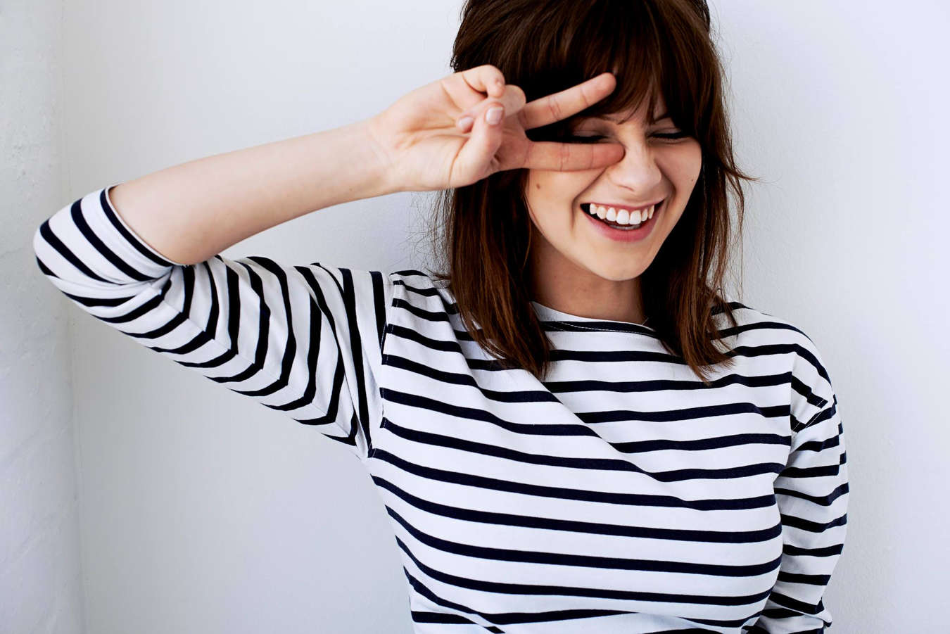
Evaluation Question 5 - FINAL
NOTES
I attracted my target audience in a number of ways; I
managed to do this because I researched into what attracts them, earlier in the
course. The colour scheme, the images, my particular model, the poses my model
makes and the graphological layout of my pages are in particular the elements
to which my audience look for, for a successful, innovative and eye catching
magazine which will make them want to read it.
The colour scheme I have used for my magazine are very
basic, of black, white and a dark red (burgundy), which is the house style of
my magazine. I believe that the dark red attracts the girls, because it has
connotations of class and sophistication, which are what females feel is their
specific role in society. On my cover and double paged spread, this colour
doesn't feature to the extent it does on the contents, because the house style
is a very exquisite theme, which I know will attract my target audience.
The use of images and how they are framed also elaborate on
the exquisite effect, because I have ensured that the border is delicate so
that it makes the magazine look neat and professional. The photos themselves
have been taken in a studio with three lights, and a Nikon D300, with clothing
arrangements sorted by myself, to ensure they fit the genre of the magazine as
well as capture the audience’s attention. I specifically decided that my
artists should wear casual clothes rather than revealing clothes, because this
would attract females instead of males, who are my main audience.
After researching into my target market, I found that
aesthetic appreciation was one factor that cropped up massively with regards to
how things are presented. I made this element of my task therefore one of the
most important because I believed that this was key, to ensure I pleased my
audience to the best of my ability, showing a range of skills.
Over the course of the production process, I took almost 400
photos, with a range of poses which I asked my models to perform. I found this
part of the task challenging, because without trying to make a picture look
cheesy, I wanted to pull of the professional look. I left it with two of the
three photos I used to be mid shot photos with the girls looking directly into
the camera with little emotion, I believed the connotations of the images I
produced indicated professionalism, as well as mystery to the audience, which
would persuade them to pick it up and read it. I then used a photo with
character for the double paged spread to show of the band in a humorous, more
chilled out way, to represent their personalities as people rather than a band.
My justification for using only mid shots in my magazine are
that I believe this was the best way to direct the emotion of my photographs
across to my audience. I feel emotion can be expressed through very little body
language, unless there is focus on the face. Thus meaning that a mid-shot was
the best image to do this, as I felt that with test shots of close ups I didn't
create the best images, and they didn't pull off a professional look. I also have used just
mid shots, because magazines such as - MOJO, Q, FADER, Dazed and Confused, Clash,
Wonderland and Rhythm use solely mid shots throughout the magazine issues I
have researched into look at. I believe therefore I have challenged the
conventions of a normal magazine, however because I have found examples this
shows that this is perhaps the way magazines are going about presenting images,
or this is the best way to present them to my specific audience. I have also
done this because I believe the images can be presented with more elegance, for
example on my front cover, the photo has a thin black border to show off the
detail with in the facial features that stand out on my band.
Monday 7 April 2014
Evaluation Question 4 - FINAL
 I have decided that my target market will be females aged 16-26, because I believe that is prime age to which where fan girls occur, as well as those who appreciate aesthetic on a page. One of my friends Krish has a big obsession with singer songwriters such as Ed Sheeran, Lewis Watson and Sam Smith, however doesn't follow them to the extent of which 'crazy' fan girls do on twitter, who follow them globally.
Krish fits my target market of mainstream fan girls because with in that category they like a wide range of clothing styles, as well as music, film and magazine variations, because they are generally just interested in most types of media. You would typically associate my type of target market with girls who spend a lot of time on twitter, and the internet following the tracking of celebrities and what they are releasing.
My band are the typical type of artist which would feature at all the main festivals, such as Glastonbury, Leeds, Reading, T in the Park and BBC Radio 1's BIG WEEKEND. This is because their fan bases are interested in a wide variety of music, which makes these festivals perfect, as they have many genres, such as Indie Rock, Electronic, Pop and Hip Hop.
On Krish's iPod, she has talented artists such as Ed Sheeran, Lewis Watson, Gabrielle Aplin, Frank Hamilton and Nina Nesbitt, however also has many unknown YouTube stars which will be up and coming with in the next few years such as Hobbie Stuart, Taylor Ames and Andrew Bazzi, who are all typical mainstream artists, who cover many different styles on song, on their channels.
In her spare time, my particular target market are interested solely in getting the latest 'gossip' and therefore fashion isn't the most important element to their lifestyle. However they do follow fashion trends, particularly ones that are taking the shops at the current time, so shopping in outlets such as ASOS, Topshop and River Island. Krish respects fashion statements made by her idol Gabrielle Aplin, however doesn't copy her because she doesn't feel she needs to, to be a fan, she can just idolise their figures, as well as the extremely expensive clothes they wear, therefore meaning she isn't bothered about designer brands as much as others her age.
Krish works in a newsagents locally, approximately two minutes walk from her house, and therefore meaning that due to not being old enough to pay board to live at home, she uses her wages of £30 a week on music from stores such as HMV and iTunes, or magazine from the place in which she works, as she gets 10% discount.
Thursday 3 April 2014

Tuesday 1 April 2014
Friday 21 March 2014
Evaluation Question 7 - DRAFT
Looking back at your preliminary task (the continuity editing task), what do you feel you have learnt in the progression from it to the full product?
 In my opinion, I feel my ability to use different technologies and software has improved greatly, due to my lack of experience with regards to using Photoshop and PagePlusXP. My knowledge of these programs was extremely limited throughout the course of the preliminary task because I hadn't really used Photoshop properly before, only for editing photos, and PagePlusXP was a new program I was introduced to by my teacher, for this project. I also improved my product through teacher and peer guidance, extra research and input/opinion from myself.
Throughout the coursework stages, my knowledge of these programs progressed rapidly, and I managed to use it them to a good extent, through the many skills I learnt and adapted to ensure my final draft was to the best of my ability and creativity. The drafting process I believe enabled me to receive lots of feedback to work with, to ensure that I could improve it to look more professional.
Due to the lack on knowledge of the technologies I was using and the magazine conventions to which make a magazine successful, my preliminary magazine was not to the best of my ability now, however was at the time when I created it. This is because from that stage to the final stage I was still learning through the research I carried out, to ensure I had a wide variety of knowledge to ensure I could make a good magazine. This meant, looking further into my target audience, house styles and fonts. This allowed me to play around with different styles in my draft to pick out the best possible design. Giving me more confidence in being able to attract the correct consumer for my product, which I feel is an important to skill to have when working with any type of media.
I have learnt that the most crucial conventions for my target audience is the image and the graphological layout of the product. The colour scheme should be basic, to ensure that the photos stand out, and the magazine attracts my particular audience. I also believe that a house style makes a magazine unique, and therefore was something I included for this reason. I really looked at developing the layout of my page as a progression point. This is because females aged 16-26 generally appreciate the aesthetic in a product, from the research I conducted. I believe I managed to do this through the use of technology i.e Photoshop and PagePlusXP.
 I didn't create a successful and aesthetically pleasing magazine because I was unaware at this point how important the F, Z and E models were to ensure that the magazine looked respectable amongst others on a shelf. I was also unaware of how the techniques such as rule of thirds and the spiral effect come in handy, and ensure that the pages image is especially put across in the correct manor. Due to my lack of knowledge of this, as well as magazine conventions I created a pretty poor standard magazine, with the audience not really easily identified, because the colour scheme wasn't researched into, to show development and planning.
I didn't create a successful and aesthetically pleasing magazine because I was unaware at this point how important the F, Z and E models were to ensure that the magazine looked respectable amongst others on a shelf. I was also unaware of how the techniques such as rule of thirds and the spiral effect come in handy, and ensure that the pages image is especially put across in the correct manor. Due to my lack of knowledge of this, as well as magazine conventions I created a pretty poor standard magazine, with the audience not really easily identified, because the colour scheme wasn't researched into, to show development and planning.
In conclusion, I believe that Photoshop is the heart to the construction of my magazine, and without it, I would have found it in great difficulty to produce the product I have on another program such as Microsoft Word. Even though I have great experience with Microsoft Word, I feel that I wouldn't be able to use it in the way I would need to if I was to create such product. My preliminary magazine indicates huge progression, as I can explain that there is little consideration taken into account with magazine conventions.
Thursday 20 March 2014
Evaluation Question 6 - DRAFT
What have you learnt about the technologies from the process of constructing this product?
 Firstly, I have used a wide range of technologies which I had little or no experience prior to this coursework. Even though this did leave slight doubt in my mind from the beginning I quickly developed a good level of skill and knowledge to keep me going through the course, and in my opinion do a good final job of my magazine product.
 I used a Nikon D300 camera, accompanied by three large filter lights inside the studio at school. I was inexperienced in working such a high technological camera, with many features, however after first photoshoot it became more natural. I have learnt how to photograph my band from different angles and shots, as well as in different places other than in the studio. I believe that this taught me, which angles and shots were best for my models, with regards to them 'pulling it off'. The lighting that I used was easy to set up, however wasn't transportable, so when I decided on doing some outdoor shots, to test the picture quality and resolution I was relying on the source of natural light to create a good enough photo.

I also used many programs on the computer, which enabled me to create my product. The two main ones were Photoshop and PagePlusXP, both of which were accessible on school computers only, so working from home wasn't straight forward. I believe I benefited from these pieces of software the most as they were what allowed me to created my magazine, as I used Photoshop for all three, and used PagePlusXP for the construction of my columns on my double paged spread which was an important element.

 I also used programs on the computer which are a package with windows: Microsoft Word and Paint. I used these resources primarily for brainstorming my article, research and planning (Word) and photo cropping and editing (Paint) to develop my product, to ensure it was the best that it could be in my opinion, along with my classmates.
 Twitter and Blogger were used as almost the same thing with regards to instant feedback. These sites allowed me to communicate with teachers and peers outside of school as well as in school, and allowed me to show evidence of opinion and support which was ongoing throughout the course. Without these technologies I would have found it extremely difficult to record and refer to points to which I could improve, so therefore it worked as a tool to increase my grade. My Tweets show evidence of planning with regards to my genre, and how important this area of the coursework was, as it was the base of the pyramid towards creating a successful magazine which would sell to your audience, in the right particular way.
I also used sites such as Cover Junkie and Magpile. These sites allowed me to find inspiration, research into magazine conventions, and ensure that my magazine which I created looked more professional, and that those magazines found would show proof of development throughout the course.
Evaluation Question 5 - DRAFT
How did you attract/address your audience?
 I attracted my target audience in a number of ways, I managed to do this because I researched into what attracts them, earlier in the course. The colour scheme, the images, my particular model, the poses my model makes and the graphological layout of my pages are in particular the elements to which my audience look for, for a successful, innovative and eye catching magazine which will make them want to read it.
 The colour scheme I have used for my magazine are very basic, of black, white and a dark red (burgundy), which is the house style of my magazine. I believe that the dark red attracts the girls, because it has connotations of class and sophistication, which are what females feel is their specific role in society. On my cover and double paged spread, this colour doesn't feature to the extent it does on the contents, because the house style is a very exquisite theme, which I know will attract my target audience.

After researching into my target market, I found that aesthetic appreciation was one factor that cropped up massively with regards to how things are presented. I made this element of my task therefore one of the most important because I believed that this was key, to ensure I pleased my audience to the best of my ability, showing a range of skills.
 Over the course of the production process, I took almost 400 photos, with a range of poses which I asked my models to perform. I found this part of the task challenging, because without trying to make a picture look cheesy, I wanted to pull of the professional look. I left it with two of the three photos I used to be mid shot photos with the girls looking directly into the camera with little emotion, I believed the connotations of the images I produced indicated professionalism, as well as mystery to the audience, which would persuade them to pick it up and read it. I then used a photo with character for the double paged spread to show of the band in a humerous, more chilled out way, to represent their personalities as people rather than a band.
My justification for using only mid shots in my magazine are that I believe this was the best way to direct the emotion of my photographs across to my audience. I feel emotion can be expressed through very little body language, unless there is focus on the face. Thus meaning that a mid shot was the best image to do this, as I felt that with test shots of close ups I didn't create the best images, and they didn't pull off a professional look. I also have used just mid shots, because magazines such as - MOJO, Q, FADER, Dazed and Confused, Clash,Wonderland and Rhythm use solely mid shots throughout the magazine issues I have researched into look at. I believe therefore I have challenged the conventions of a normal magazine, however because I have found examples this shows that this is perhaps the way magazines are going about presenting images, or this is the best way to present them to my specific audience. I have also done this because I believe the images can be presented with more elegance, for example on my front cover, the photo has a thin black border to show off the detail with in the facial features that stand out on my band.
Evaluation Question 4 - DRAFT
Who would be the audience for your media product?
 I have decided that my target market will be females aged 16-26, because I believe that is prime age to which where fan girls occur, as well as those who appreciate aesthetic on a page. One of my friends Krish has a big obsession with singer songwriters such as Ed Sheeran, Lewis Watson and Sam Smith, however does't follow them to the extent of which 'crazy' fan girls do on twitter, who follow them globally.
Krish fits my target market of mainstream fan girls because with in that category they like a wide range of clothing styles, as well as music, film and magazine variations, because they are generally just interested in most types of media. You would typically associate my type of target market with girls who spend a lot of time on twitter, and the internet following the tracking of celebrities and what they are releasing.
My band are the typical type of artist which would feature at all the main festivals, such as Glastonbury, Leeds, Reading, T in the Park and BBC Radio 1's BIG WEEKEND. This is because their fan bases are interested in a wide variety of music, which makes these festivals perfect, as they have many genres, such as Indie Rock, Electronic, Pop and Hip Hop.
 On Krish's iPod, she has talented artists such as Ed Sheeran, Lewis Watson, Gabrielle Aplin, Frank Hamilton and Nina Nesbitt, however also has many unknown YouTube stars which will be up and coming with in the next few years such as Hobbie Stuart, Taylor Ames and Andrew Bazzi, who are all typical mainstream artists, who cover many different styles on song, on their channels.
In her spare time, my particular target market are interested solely in getting the latest 'gossip' and therefore fashion isn't the most important element to their lifestyle. However they do follow fashion trends, particularly ones that are taking the shops at the current time, so shopping in outlets such as ASOS, Topshop and River Island. Krish respects fashion statements made by her idol Gabrielle Aplin, however doesn't copy her because she doesn't feel she needs to, to be a fan, she can just idolise their figures, as well as the extremely expensive clothes they wear, therefore meaning she isn't bothered about designer brands as much as others her age.
Krish works in a newsagents locally, approximately two minutes walk from her house, and therefore meaning that due to not being old enough to pay board to live at home, she uses her wages of £30 a week on music from stores such as HMV and iTunes, or magazine from the place in which she works, as she gets 10% discount.
Wednesday 19 March 2014
Evaluation Question 3 - DRAFT
What kind of media institution might distribute your media product and why?
 I have decided that Bauer Media would be the most beneficial source of distribution for my magazine for a number of reasons. The company has many characteristics which I feel would benefit the breadth to which my magazine would reach worldwide.
This company are one of Europe's largest media organisations which distribute a range of sources, to many countries across the continent, with contracts with companies such as HFM, Kiss FM and The Box. Due to the large range of media they do distribute to, I believe that this company have good levels of experience, and will enable my product to be read by their regular audience custom who fit with in my target market especially. The company focuses on magazine and radio predominantly and is known for being "widely recognised and rewarded as being industry innovators". I believe that this would be beneficial for my product because it means that a wider audience of people will be able to have access to my magazine, at no excess cost. In my opinion I feel due to them having a "wide portfolio of influential brands" giving them "advantages over pure play magazine or radio competitors" they will give my magazine a good potential success rate before it is even distributed. Bauer also have a huge connection with in social media sites such as 'Vimeo' 'Tumblr' 'Twitter' 'Facebook' and 'YouTube' which will publicize it worldwide as well as throughout Europe, which after a period of time would be an aim.
I believe that Bauer Media would be able to ensure my magazine is read by my target audience, because they have connections with Q and MOJO magazine which I believe to be extremely successful with their monthly prints, especially in the UK. This institution also works with the magazine 'closer' so they are aware of how to appeal to a female audience.
With Bauer Media presenting subscription offers across the internet for many magazines, It could then expand further in coming years to reaching sites such as Itunes which can then allow Apple users to download the magazine. I believe that this is essential for success, and Bauer Media have a strategic method, of ensuring it. I would work to ensure that my magazine was bought monthly for the price of £3.50.
I have decided that Bauer Media would be the most beneficial source of distribution for my magazine for a number of reasons. The company has many characteristics which I feel would benefit the breadth to which my magazine would reach worldwide.This company are one of Europe's largest media organisations which distribute a range of sources, to many countries across the continent, with contracts with companies such as HFM, Kiss FM and The Box. Due to the large range of media they do distribute to, I believe that this company have good levels of experience, and will enable my product to be read by their regular audience custom who fit with in my target market especially. The company focuses on magazine and radio predominantly and is known for being "widely recognised and rewarded as being industry innovators". I believe that this would be beneficial for my product because it means that a wider audience of people will be able to have access to my magazine, at no excess cost. In my opinion I feel due to them having a "wide portfolio of influential brands" giving them "advantages over pure play magazine or radio competitors" they will give my magazine a good potential success rate before it is even distributed. Bauer also have a huge connection with in social media sites such as 'Vimeo' 'Tumblr' 'Twitter' 'Facebook' and 'YouTube' which will publicize it worldwide as well as throughout Europe, which after a period of time would be an aim.
I believe that Bauer Media would be able to ensure my magazine is read by my target audience, because they have connections with Q and MOJO magazine which I believe to be extremely successful with their monthly prints, especially in the UK. This institution also works with the magazine 'closer' so they are aware of how to appeal to a female audience.
With Bauer Media presenting subscription offers across the internet for many magazines, It could then expand further in coming years to reaching sites such as Itunes which can then allow Apple users to download the magazine. I believe that this is essential for success, and Bauer Media have a strategic method, of ensuring it. I would work to ensure that my magazine was bought monthly for the price of £3.50.
Evaluation Question 2 - DRAFT
How does your media product represent particular social groups?
My magazine is mainstream collectively, with elements from different genres, however it is more pop orientated with regards to the artists that have articles written about them inside, who feature, especially in the issue I created. The reason as to why I have done this is because I feel for this genre of music there are larger fan bases, and it is much easier to please an audience.
The content of my magazine is similar to Q in the way that it presents a range of artists, however differs, due to the style of music and the genre of artists included. The colour schemes are dissimilar, and the fonts used aren't as bold, as in my opinion Q is directed more at a male audience, where as mine is female. For example, bands such as The 1975 feature in Q magazine, whereas if you were to associate an artist in my magazine you would go down the Ed Sheeran route, as he perceives to have more of a fan girl base than The 1975, however with regards to looks, and outer appearance, my band are similar to Little Mix.
My magazine is targeted more at a fan girl social group, the group which specifies in girls especially who follow music artists and celebrities to excessive extents, and attend their solo gigs, and go to any events possible that they can. In some cases this means that fans travel globally just to have a shot at either meeting their idol, or seeing them live, for the twentieth time. This usually occurs with in the ages of 16-26 which is also my target market for the magazine, so in my opinion I believe that it will sell, as the fans will be sold exclusive interviews about their favourite artists.
 My band (Tessellation) are represented with the gaze theory attached, however, I didn't rely on this theory to create particular images due to my audience being females. A quote taken from UK Tribes says that girls have an "unwavering devotion to mainstream pop icons" so therefore meaning they will act as role models to younger generations just like Little Mix do, as they are the current version of the Spice Girls from when my generation grew up.
The photographs I produced with in my magazine don't use the 'gaze' effect to a large extent, however there are elements of it represented through facial expression so that they look aesthetically pleasing to the eye. I do believe that the clothes I dressed them in, to an extent were representing the mainstream genre, however the photo I used on the contents page included one of my artists wearing an indie shirt. I challenged the conventions of my genre, as I took a risk in what my model was wearing. However I believe due to indie fashion being more mainstream at this current time period, I decided that along with explanation as to why I used it, it would work.
The layout of my pages reflects more of an indie genre, however I decided to do this as in my opinion I believe that it reflects a mainstream edge, as every page is different, however there are small characteristics which link each page together, which to an extent challenges the conventions. This therefore meaning it challenges my base of social group I am targeting, as they usually would read pages which lots of colour, and lots of stuff going on across the page. I decided against this idea, to make my magazine individual, as well as increasing its formality and presentation levels. I didn't think that a busier layout would be impossible because my Photoshop skills are of a good standard, I just didn't think my band would pull of this style as well as other bands perhaps could, as they aren't a 'typical' girl band, with the stereotype strapped across their name.
Tuesday 18 March 2014
Evaluation Question 1 - DRAFT
In what ways does your media product use, develop or
challenge forms and conventions of real media products?

My media product uses Loud and Quiet magazine as a style to
base on, to ensure that I capture my target audience in the right way. I did
this because from looking at years previous, the students who tended to follow
conventions rather than challenge them, gained more marks.
The specific style of alignment and bold features such as
the masthead and border around the cover's image was emulated on to my magazine
and used as a way of increasing the professionalism of the product. Also, Loud
and Quiet uses the rule of thirds effectively to frame and present the cover in the best way to which it
will stand out on a shelf. I adapted this technique, to ensure that three main
features stood out - the masthead, the image and the content. This is a very
well known convention for many magazine designs, as well as the spiral effect,
which is generally used to present an artistic image, ensuring it is the main
focal point. Another convention which accompanies the layout is the colour, and
depending on the genre and layout of the magazine, will determine what colours
work, and which ones don't. For a design such as Loud and Quiet, black and
white commonly feature as a part of a house style, along with a few other
colours, which fit the theme of the photo, or which work well alongside it to
ensure it stands out, and is more aesthetically pleasing. When I began designing my magazine I took into account the
main conventional features to ensure that when producing the layout, and
particularly choosing the photo, I was able to ensure it was clear that I used
inspiration, but only took out specific elements so it still attained
individuality.
When I began designing my magazine I took into account the
main conventional features to ensure that when producing the layout, and
particularly choosing the photo, I was able to ensure it was clear that I used
inspiration, but only took out specific elements so it still attained
individuality.
My masthead, however not as bold as most magazines, was in
'Perpetua Titling' font which I believe gave it the elegant factor. This worked
well alongside the thinness of the lines which separated each section of my cover.
The positioning of my masthead slightly challenges the convention of it being
across the top of the page, as I have slightly lowered it with the context of
the product above it to indicate what type of magazine it is. I ensured that
the masthead was in a clear space, with nothing overlapping or surrounding it
purposely due to the fact for my particular style, as it is simplistic, with
not much going on. This keeps the neat and tidiness effect, which will sell my
magazine to my target audience. My masthead particularly relates to the Loud
and Quiet design, in relation to the position of it on the page, as well as as
the colour. The reason as to why I decided to keep it black, was because it not
only goes with all other colours, but it increases the aesthetic as well as the
professionalism. I did however slightly
challenge the convention with regards to the masthead when comparing it to such
magazines like Clash, due to the fact that my masthead wasn't displayed in
bold, even though comparing it to the Vogue masthead there isn't much of a
distinguished difference.  The graphology of my pages is unique, and taken from
different sources of magazine layouts, the reasons as to why I have used
different sources of inspiration for each page, was to adapt and develop the use of different styles, to, in a way,
challenge the conventions, to see if there was a continued theme, without being
purposely conscious of linking them together. I thought this brought variation
to my magazine, and was a technique used to ensure that my readers don't get
bored when flicking through. I carried a theme of black lines through my pages,
however, the thickness of them varies. My reasoning for having thinner lines on
the cover was to represent elegance as said before, however I ensured that I
kept the thickness of the lines on the contents the same as the border on the
double paged spread, so they looked as a part of the same magazine, rather than
different pages pulled out from multiple documents.
The graphology of my pages is unique, and taken from
different sources of magazine layouts, the reasons as to why I have used
different sources of inspiration for each page, was to adapt and develop the use of different styles, to, in a way,
challenge the conventions, to see if there was a continued theme, without being
purposely conscious of linking them together. I thought this brought variation
to my magazine, and was a technique used to ensure that my readers don't get
bored when flicking through. I carried a theme of black lines through my pages,
however, the thickness of them varies. My reasoning for having thinner lines on
the cover was to represent elegance as said before, however I ensured that I
kept the thickness of the lines on the contents the same as the border on the
double paged spread, so they looked as a part of the same magazine, rather than
different pages pulled out from multiple documents.
My favourite page with regards to graphological features is
my double paged spread, as i feel i have successfully gained a more
professional aesthetic, after completely re-styling post to my draft, which
wasn't as good as I'd hoped. I believe the use of negative space works,
emulating a coloured version of a Loud and Quiet article, and adapting it to
making it fit with my house style. I believe the fonts work, the colour scheme
compliments the overall aesthetic, and the photo brings out the pages
character. When creating this page, I had no intention of displaying more than
one image after finding inspiration post to my draft, as I felt, as long as my
photo had something about it that made it stand out it wouldn't look boring,
sadistic or even miserable, meaning that it would work, providing it was
intriguing.
 When using conventional features regarding photography, in
particular mise en scene, it tends to be overwhelmingly difficult to meet the
standard of a professional photographer, especially one with experience. Thus
meaning, taking plenty of shots, with a wide variety of different outfits that
worked in my opinion, supporting my genre, were important to almost be
confident of success. I decided that having a female band would attract my
prime audience of females aged 16-26, however could sway the male gaze in a way
which could potentially attract a different audience as well. Without the
unnecessary 'half naked shots' they use across most pop/indie magazines in this
present day, I had to really ensure my models most photogenic features were
displayed across their faces in order to attract attention. I did this by
reducing levels of make up, so that hair stood out on both girls as a
characteristic itself, as bands such as Little Mix always present themselves in
this way. Due to my models being particularly photogenic without makeup, I
decided that it was mainly needed around the eyes, to enhance those as a
different focal feature, which would attract an audience, this time perhaps the
male gaze effect would occur, regardless of them not being my target audience.
When using conventional features regarding photography, in
particular mise en scene, it tends to be overwhelmingly difficult to meet the
standard of a professional photographer, especially one with experience. Thus
meaning, taking plenty of shots, with a wide variety of different outfits that
worked in my opinion, supporting my genre, were important to almost be
confident of success. I decided that having a female band would attract my
prime audience of females aged 16-26, however could sway the male gaze in a way
which could potentially attract a different audience as well. Without the
unnecessary 'half naked shots' they use across most pop/indie magazines in this
present day, I had to really ensure my models most photogenic features were
displayed across their faces in order to attract attention. I did this by
reducing levels of make up, so that hair stood out on both girls as a
characteristic itself, as bands such as Little Mix always present themselves in
this way. Due to my models being particularly photogenic without makeup, I
decided that it was mainly needed around the eyes, to enhance those as a
different focal feature, which would attract an audience, this time perhaps the
male gaze effect would occur, regardless of them not being my target audience.  When following conventions of a 'perfect' photograph, it is
said that the model looks directly into the camera to ensure that they connect
themselves with the audience. I however decided that for my double paged
spread, in order to create a photo with charisma and character I needed to
break this convention to defeat the boring element.
When following conventions of a 'perfect' photograph, it is
said that the model looks directly into the camera to ensure that they connect
themselves with the audience. I however decided that for my double paged
spread, in order to create a photo with charisma and character I needed to
break this convention to defeat the boring element.
However, I believe that I have challenged the conventions of the Loud and Quiet style model, because my magazine is a singer songwriter/ pop genre, where as Loud and Quiet is an alternative indie rock style of magazine.
My magazine has slightly challenged the conventions of a
music magazine in one or two vague areas, the reason as to why I decided to
avoid technique such as this was because I felt it wouldn't attract my
particular audience in the way it should, and therefore, I avoided many risks.
In what ways does your media product use, develop or
challenge forms and conventions of real media products?
My media product uses Loud and Quiet magazine as a style to
base on, to ensure that I capture my target audience in the right way. I did
this because from looking at years previous, the students who tended to follow
conventions rather than challenge them, gained more marks.
The specific style of alignment and bold features such as
the masthead and border around the cover's image was emulated on to my magazine
and used as a way of increasing the professionalism of the product. Also, Loud
and Quiet uses the rule of thirds effectively to frame and present the cover in the best way to which it
will stand out on a shelf. I adapted this technique, to ensure that three main
features stood out - the masthead, the image and the content. This is a very
well known convention for many magazine designs, as well as the spiral effect,
which is generally used to present an artistic image, ensuring it is the main
focal point. Another convention which accompanies the layout is the colour, and
depending on the genre and layout of the magazine, will determine what colours
work, and which ones don't. For a design such as Loud and Quiet, black and
white commonly feature as a part of a house style, along with a few other
colours, which fit the theme of the photo, or which work well alongside it to
ensure it stands out, and is more aesthetically pleasing.
My masthead, however not as bold as most magazines, was in
'Perpetua Titling' font which I believe gave it the elegant factor. This worked
well alongside the thinness of the lines which separated each section of my cover.
The positioning of my masthead slightly challenges the convention of it being
across the top of the page, as I have slightly lowered it with the context of
the product above it to indicate what type of magazine it is. I ensured that
the masthead was in a clear space, with nothing overlapping or surrounding it
purposely due to the fact for my particular style, as it is simplistic, with
not much going on. This keeps the neat and tidiness effect, which will sell my
magazine to my target audience. My masthead particularly relates to the Loud
and Quiet design, in relation to the position of it on the page, as well as as
the colour. The reason as to why I decided to keep it black, was because it not
only goes with all other colours, but it increases the aesthetic as well as the
professionalism. I did however slightly
challenge the convention with regards to the masthead when comparing it to such
magazines like Clash, due to the fact that my masthead wasn't displayed in
bold, even though comparing it to the Vogue masthead there isn't much of a
distinguished difference.
My favourite page with regards to graphological features is
my double paged spread, as i feel i have successfully gained a more
professional aesthetic, after completely re-styling post to my draft, which
wasn't as good as I'd hoped. I believe the use of negative space works,
emulating a coloured version of a Loud and Quiet article, and adapting it to
making it fit with my house style. I believe the fonts work, the colour scheme
compliments the overall aesthetic, and the photo brings out the pages
character. When creating this page, I had no intention of displaying more than
one image after finding inspiration post to my draft, as I felt, as long as my
photo had something about it that made it stand out it wouldn't look boring,
sadistic or even miserable, meaning that it would work, providing it was
intriguing.
When using conventional features regarding photography, in
particular mise en scene, it tends to be overwhelmingly difficult to meet the
standard of a professional photographer, especially one with experience. Thus
meaning, taking plenty of shots, with a wide variety of different outfits that
worked in my opinion, supporting my genre, were important to almost be
confident of success. I decided that having a female band would attract my
prime audience of females aged 16-26, however could sway the male gaze in a way
which could potentially attract a different audience as well. Without the
unnecessary 'half naked shots' they use across most pop/indie magazines in this
present day, I had to really ensure my models most photogenic features were
displayed across their faces in order to attract attention. I did this by
reducing levels of make up, so that hair stood out on both girls as a
characteristic itself, as bands such as Little Mix always present themselves in
this way. Due to my models being particularly photogenic without makeup, I
decided that it was mainly needed around the eyes, to enhance those as a
different focal feature, which would attract an audience, this time perhaps the
male gaze effect would occur, regardless of them not being my target audience.
However, I believe that I have challenged the conventions of the Loud and Quiet style model, because my magazine is a singer songwriter/ pop genre, where as Loud and Quiet is an alternative indie rock style of magazine.
My magazine has slightly challenged the conventions of a
music magazine in one or two vague areas, the reason as to why I decided to
avoid technique such as this was because I felt it wouldn't attract my
particular audience in the way it should, and therefore, I avoided many risks.

The specific style of alignment and bold features such as
the masthead and border around the cover's image was emulated on to my magazine
and used as a way of increasing the professionalism of the product. Also, Loud
and Quiet uses the rule of thirds effectively to frame and present the cover in the best way to which it
will stand out on a shelf. I adapted this technique, to ensure that three main
features stood out - the masthead, the image and the content. This is a very
well known convention for many magazine designs, as well as the spiral effect,
which is generally used to present an artistic image, ensuring it is the main
focal point. Another convention which accompanies the layout is the colour, and
depending on the genre and layout of the magazine, will determine what colours
work, and which ones don't. For a design such as Loud and Quiet, black and
white commonly feature as a part of a house style, along with a few other
colours, which fit the theme of the photo, or which work well alongside it to
ensure it stands out, and is more aesthetically pleasing.
When I began designing my magazine I took into account the
main conventional features to ensure that when producing the layout, and
particularly choosing the photo, I was able to ensure it was clear that I used
inspiration, but only took out specific elements so it still attained
individuality.
My masthead, however not as bold as most magazines, was in
'Perpetua Titling' font which I believe gave it the elegant factor. This worked
well alongside the thinness of the lines which separated each section of my cover.
The positioning of my masthead slightly challenges the convention of it being
across the top of the page, as I have slightly lowered it with the context of
the product above it to indicate what type of magazine it is. I ensured that
the masthead was in a clear space, with nothing overlapping or surrounding it
purposely due to the fact for my particular style, as it is simplistic, with
not much going on. This keeps the neat and tidiness effect, which will sell my
magazine to my target audience. My masthead particularly relates to the Loud
and Quiet design, in relation to the position of it on the page, as well as as
the colour. The reason as to why I decided to keep it black, was because it not
only goes with all other colours, but it increases the aesthetic as well as the
professionalism. I did however slightly
challenge the convention with regards to the masthead when comparing it to such
magazines like Clash, due to the fact that my masthead wasn't displayed in
bold, even though comparing it to the Vogue masthead there isn't much of a
distinguished difference.
The graphology of my pages is unique, and taken from
different sources of magazine layouts, the reasons as to why I have used
different sources of inspiration for each page, was to adapt and develop the use of different styles, to, in a way,
challenge the conventions, to see if there was a continued theme, without being
purposely conscious of linking them together. I thought this brought variation
to my magazine, and was a technique used to ensure that my readers don't get
bored when flicking through. I carried a theme of black lines through my pages,
however, the thickness of them varies. My reasoning for having thinner lines on
the cover was to represent elegance as said before, however I ensured that I
kept the thickness of the lines on the contents the same as the border on the
double paged spread, so they looked as a part of the same magazine, rather than
different pages pulled out from multiple documents.
My favourite page with regards to graphological features is
my double paged spread, as i feel i have successfully gained a more
professional aesthetic, after completely re-styling post to my draft, which
wasn't as good as I'd hoped. I believe the use of negative space works,
emulating a coloured version of a Loud and Quiet article, and adapting it to
making it fit with my house style. I believe the fonts work, the colour scheme
compliments the overall aesthetic, and the photo brings out the pages
character. When creating this page, I had no intention of displaying more than
one image after finding inspiration post to my draft, as I felt, as long as my
photo had something about it that made it stand out it wouldn't look boring,
sadistic or even miserable, meaning that it would work, providing it was
intriguing.
When using conventional features regarding photography, in
particular mise en scene, it tends to be overwhelmingly difficult to meet the
standard of a professional photographer, especially one with experience. Thus
meaning, taking plenty of shots, with a wide variety of different outfits that
worked in my opinion, supporting my genre, were important to almost be
confident of success. I decided that having a female band would attract my
prime audience of females aged 16-26, however could sway the male gaze in a way
which could potentially attract a different audience as well. Without the
unnecessary 'half naked shots' they use across most pop/indie magazines in this
present day, I had to really ensure my models most photogenic features were
displayed across their faces in order to attract attention. I did this by
reducing levels of make up, so that hair stood out on both girls as a
characteristic itself, as bands such as Little Mix always present themselves in
this way. Due to my models being particularly photogenic without makeup, I
decided that it was mainly needed around the eyes, to enhance those as a
different focal feature, which would attract an audience, this time perhaps the
male gaze effect would occur, regardless of them not being my target audience.
When following conventions of a 'perfect' photograph, it is
said that the model looks directly into the camera to ensure that they connect
themselves with the audience. I however decided that for my double paged
spread, in order to create a photo with charisma and character I needed to
break this convention to defeat the boring element.
However, I believe that I have challenged the conventions of the Loud and Quiet style model, because my magazine is a singer songwriter/ pop genre, where as Loud and Quiet is an alternative indie rock style of magazine.
However, I believe that I have challenged the conventions of the Loud and Quiet style model, because my magazine is a singer songwriter/ pop genre, where as Loud and Quiet is an alternative indie rock style of magazine.
My magazine has slightly challenged the conventions of a
music magazine in one or two vague areas, the reason as to why I decided to
avoid technique such as this was because I felt it wouldn't attract my
particular audience in the way it should, and therefore, I avoided many risks.
Monday 17 March 2014


Subscribe to:
Posts (Atom)